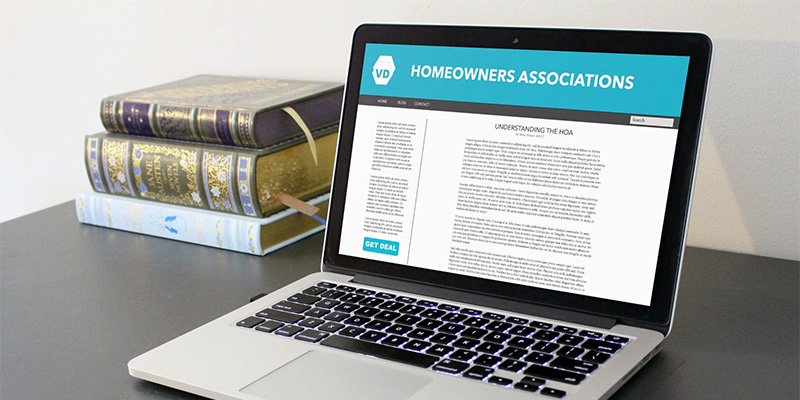
11 Important Features And Design Elements Of A Good HOA Website

A well-made homeowners association website does more than just present information. A great HOA website consists of thoroughly crafted, related modules that make HOA management easier.
Browse By Category
Sign up for Our Newsletter
A well-made homeowners association website does more than just present information. A great HOA website consists of thoroughly crafted, related modules that make HOA management easier.
What Characteristics Define a Good HOA Website?
When shopping for a website for your association, it is important to consider its features and characteristics. What will make managing your community easier? No two associations are the same, but, generally, the best websites for HOA use should consist of the following features and elements:
1. A Dedicated Domain
 Having a dedicated domain for your website will make it easy for people to find it. When naming your domain, go with something straightforward.
For example, if your HOA is named “ABC Homeowners Association,” then something along the lines of www.abchoa.com works.
2. An Online Portal for Residents
The best HOA websites have a two-in-one function — to serve both existing and potential homeowners. The current members of your community need a way to quickly perform HOA-related tasks. This includes accessing their account balance, filing service requests, and retrieving important documents. And what better way to do that than to have a built-in online portal for residents?
One of the best HOA website examples that do this is Walden Lake in Plant City, Florida. Members get instant access to the information they need as well as the tasks they must perform through the integrated resident portal.
For security purposes, though, each homeowner should have their own password-protected user account, and board members should have the ability to manage these accounts.
3. Online Payment Options
Some HOAs collect dues the traditional way through mail-in checks, but this is a very inefficient and, not to mention, inconvenient method. The best association websites have integrated online payment options that allow homeowners to settle their dues and fees through their user accounts.
4. A Community Calendar
There’s a lot of time between the first announcement of a community event and the actual event itself. During that time, residents can forget about the event and fail to attend. But, with a community calendar, residents can stay up-to-date on all upcoming events and plan their schedules accordingly. Thus, your HOA website should have a built-in calendar that homeowners can easily pull up.
Walnut Creek perfectly captures how community calendars should be done. They show upcoming events right in the middle of the screen and show other important events, such as board meetings, on the right panel.
5. Communication Channels
An HOA website is a one-stop-shop for all things HOA-related, so it should naturally accommodate communication between members. Great websites have forums where members can discuss everything from gardening tips to clarifications on HOA rules.
The best HOA websites also have a dedicated section for announcements. Not only does this save both time and money for the association, but it also allows for instant information dissemination.
For good HOA website examples, take Village Green’s, which includes a section for news and events right on its homepage. Because these sections use large, bold letters against a white background, they instantly catch your eye and make reading easy.
6. Polling Abilities
Although not a mandatory feature, it’s worth getting an HOA website that lets you take polls. This will simplify the voting process, eliminating the need to conduct in-person votes. Of course, the polling features should also come with limitation options, such as only allowing each homeowner to vote once.
7. Amenity Reservation
Some homeowners associations, especially those that are home to thousands of members, restrict the number of people allowed in each community amenity at any given time. Instead of doing it the old-fashioned way with phone calls, automate amenity reservation with an HOA website. Such a feature should also include an automatic standby line and require residents to agree to the common area rules before completing each reservation.
8. Mobile-Friendly
 About half of the world’s web traffic originating from mobile sources. Therefore, the best HOA websites should be mobile-friendly.
That means having a website layout and user experience that’s compatible with mobile devices. Some providers even go one step further by providing associations with an app for on-the-go access.
Being mobile-ready isn’t confined to a website’s UI and UX, though. It should also allow for push notifications. With push notifications enabled, homeowners can instantly know the latest news and announcements. Never miss a payment again with deadline reminders. Keep in mind, though, that some homeowners might not find push notifications appealing, so it’s important to give them the option to turn it off.
9. Easy to Use
It goes without saying that your HOA website should make things easier for everyone involved, so it naturally shouldn’t be difficult to use. It’s hard to beat a simple layout with an intuitive design. Sections should flow smoothly from one to the other, leaving no room for unnecessary elements and navigation confusion.
10. Easy to Maintain
While the front-end of an HOA website is important, you should pay equal attention to the back-end. Good custom HOA sites are easy to maintain and require no programming background to build or alter. After all, you don’t want to have to call customer support or an association web design specialist just to be able to post updates or make calendar adjustments.
11. Showcases the Community
HOA websites should provide value to both existing homeowners and potential buyers. If you want to attract new members into the community, you must showcase your neighborhood in a way that’s appealing yet not intimidating. Tell your association’s story, share photos of the community, and lay down all the essential information that new visitors might need.
One example of an HOA website that does this well is Wolf Lake HOA in New Albany, Indiana. Once you get to their homepage, you’re immediately shown a beautiful photo of a lake before diving into the community’s story, image gallery, and important details.
Where to Get HOA Website Templates
When it comes to design, having an HOA website template really helps. But, where exactly can you find these templates? There are a lot of HOA website hosts, such as Townsq and Wild Apricot. If you want a free HOA website, try GoGladly.com and HOA Express, though such websites usually charge a recurring fee for added features.
Apart from HOA website hosts, there are also self-managed HOA software providers that offer management features along with website services. Condo Manager, for instance, boasts integrated management solutions for both self-managed communities and HOA management companies. They also offer website services that come with an online portal for residents.
The Benefits of Homeowners Association Websites
Websites are excellent HOA communication tools. They also help your HOA board volunteers keep on top of tasks for the HOA. Still on the fence? Consider how you can benefit from an HOA website below:
- Resident Communication. This is something that commonly HOAs struggle with. With an HOA website, you get a solution that grows with your community. HOA websites make it possible to post upcoming events in the community so that residents are informed and make the time to attend.
- Maintenance Tasks. HOA websites have all sorts of features depending on the level of sophistication your HOA is looking for. There are ways to input maintenance requests or other services that the HOA offers to its residents. An online form will streamline and organize requests. This improved level of organization will increase resident satisfaction in both the short and long-term.
- Important Announcements. By having a website, you can post announcements online instantly. It’s a lot faster to make an online calendar update, compared to leaving a note on each homeowner’s door.
- Posting of HOA Rules & Regulations. By putting your CC&Rs and rules online, you provide an excellent way for residents to have access to them. They can check, anytime, which rules and regulations apply to an issue that they may be facing.
- Required Applications & Forms. Renovations, fencing, and landscaping projects usually need to go through an application process to ensure adherence to the community covenants. Having everything readily available via an HOA website goes a long way toward streamlining the approval process. Your HOA board saves time and effort while your residents get instant access to your forms, too.
Get an HOA Website Today
The best HOA websites have a dedicated domain, an online portal for their residents, online payment options, a community calendar, communication channels, polling abilities, and amenity reservation features. They’re also mobile-friendly, easy to use and maintain, and showcase the community. When designing your HOA website, make sure to keep these features and design elements in mind.
Some HOA management companies offer websites as part of their package. If you’re looking for the right management company for your HOA, head over to HOA Management’s online directory.
Related Articles
- HOA Social Media Policy: What Rules To Enforce?
- 6 Benefits Of HOA Living
- How Important Is Using An HOA Software for HOA Management?
Trending Now
Related Article
Sign up for Our Monthly Newsletter
Sign up below for monthly updates on all HOA Resource


